
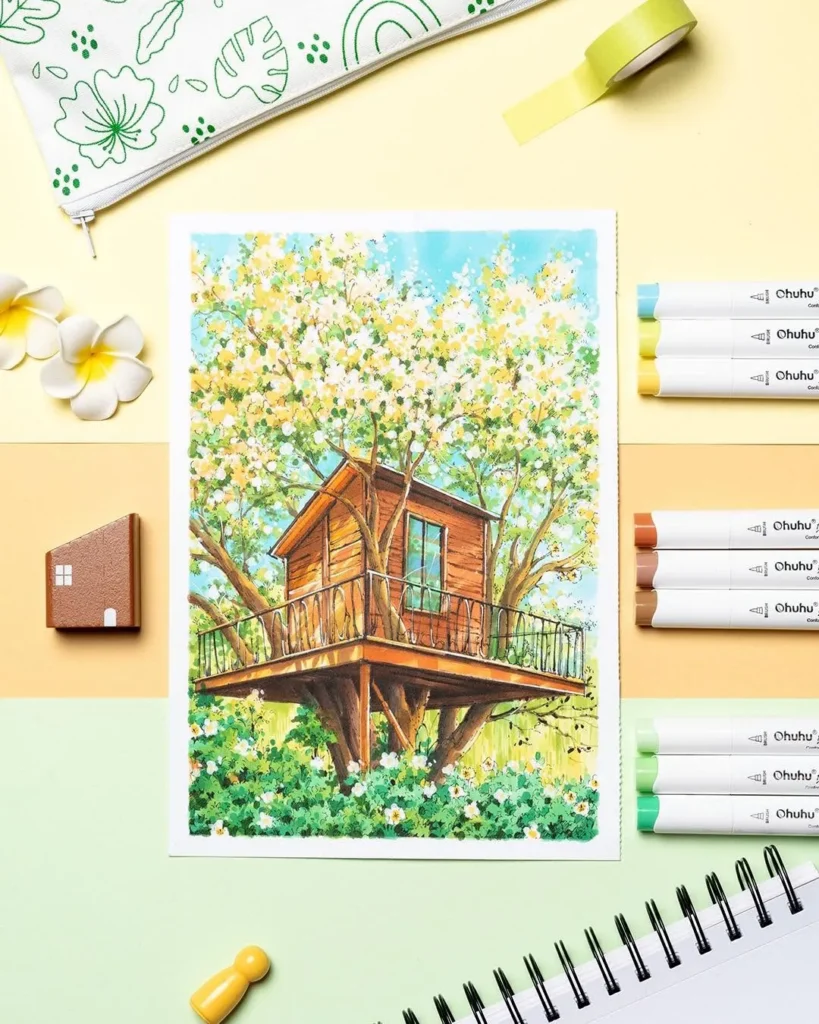
Nature is full of colour, but not always in the way we expect. A tree is rarely just green. Its leaves might include touches of yellow, olive, brown or even blue, depending on the light. Soil can shift from pale sand to deep red, while distant mountains often appear more blue-grey than brown.
That is what makes landscape drawing so enjoyable. You are not simply colouring in a scene, you are building light, depth and atmosphere.
A huge marker collection can be helpful, but it is not essential. A thoughtfully chosen selection of Ohuhu marker colours can give you everything you need to draw forests, mountains, beaches, gardens and open South African landscapes.
Here are the most useful colour groups to include in your landscape marker palette.
Start with a Good Mix of Greens
Green is an obvious choice for nature drawings, but using one bright green across an entire landscape can quickly make the scene feel flat. Real foliage contains a surprising variety of colours.
A practical selection should include:
- Yellow-green for fresh leaves and sunlit grass.
- Olive green for shrubs, dry grass and natural foliage.
- A balanced mid-green for trees and plants.
- Blue-green for cool, shaded areas.
- Deep green for dense vegetation and shadows.
Olive and muted greens are especially useful when drawing South African scenery. They suit fynbos, veld, indigenous plants and the drier vegetation found across much of the country.
Try starting with your lightest green, then add a mid-tone to create shape. Finish with a darker green in the areas where leaves overlap or branches block the light. Leaving small areas of the lightest shade visible will make the foliage feel more lively.
Choose Blues for Skies, Water and Distance
Blue is not only for colouring the sky. It can be used for water, cool shadows, distant mountains and even sections of dark green foliage.
Your landscape collection should ideally include:
- A very pale blue for clear skies and subtle reflections.
- A mid-blue for open water and stronger sky colour.
- A blue-grey for clouds, mist and distant scenery.
- A deeper blue for shaded water and dramatic skies.
For a natural-looking daytime sky, use the palest blue close to the horizon. Gradually introduce a stronger blue as you move towards the top of the page. A sky that is exactly the same shade from top to bottom can sometimes look a little too solid.
Blue-grey is one of the most useful landscape colours you can own. It creates the hazy appearance of distant mountains without pulling attention away from the foreground. Objects in the distance generally appear lighter, cooler and less detailed, so there is no need to draw every distant tree or rock.
Do Not Forget Earthy Browns
A good brown palette offers far more than one light and one dark shade. Nature includes warm soil, pale sand, reddish rocks, weathered wood and grey-brown tree bark.
Useful earthy colours include:
- Sand or beige.
- Ochre.
- Warm tan.
- Terracotta.
- Reddish brown.
- Deep brown.
- Warm grey.
For tree trunks, begin with tan or warm grey instead of immediately reaching for the darkest brown. Add medium brown to suggest the texture of the bark, then use deep brown only in the strongest shadows.
Ochre and terracotta are excellent choices for warm rocks, autumn leaves and late-afternoon landscapes. They also work well when drawing dry grass, pathways and soil.
Keep Warm and Cool Greys Nearby
Grey markers may not look particularly exciting in the case, but they are incredibly useful once you begin drawing.
Warm greys work well for stone, dry branches, pathways, dusty ground and soft cloud shadows. Cool greys are better for mountains, rainy skies, water reflections and shaded forest areas.
Grey can also help calm down a colour that feels too bright. If a green section is starting to look unnatural, a small amount of muted green or grey in the shadow areas can make a big difference.
Avoid using black for every shadow. Pure black can feel harsh in a natural scene. Deep green, dark brown, navy or charcoal will often create a softer and more believable result.
Add Warm Colours for Sunlight
Yellow, orange and red can completely change the feeling of a landscape drawing. They bring warmth to sunsets, autumn scenes, dry grass and sunlit areas.
For sunrise or sunset drawings, try combining:
- Pale yellow.
- Golden yellow.
- Peach.
- Soft orange.
- Coral.
- Muted red.
- Violet.
Begin with pale yellow around the brightest part of the sky. Move gradually into peach, orange and red, then add violet or blue-grey to the clouds and darker sections.
Warm colours can also be used as small accents in a mostly green landscape. A few orange leaves, golden grasses or red flowers can guide the viewer’s eye towards the most important part of the drawing.
Add a Few Colours for Flowers and Smaller Details
You do not need a full rainbow of floral shades unless botanical drawing is your main focus. A small selection of pink, purple, red and yellow markers will usually be enough for wildflowers, garden scenes and other details.
Choose at least one light and one dark shade from your favourite colour family. For example, pale pink, rose and burgundy can work together to give flower petals more shape.
Purple is particularly versatile. Apart from flowers, it can be used in mountain shadows, evening skies and storm clouds. A muted purple also pairs beautifully with olive green, ochre and warm brown.
Alcohol-Based or Water-Based Ohuhu Markers?
Both Ohuhu alcohol-based markers and water-based markers can be used for landscape and nature drawings, but they offer different creative possibilities.
Alcohol-based markers are a good choice when you want smooth colour transitions, rich coverage and bold illustrations. They are especially useful for layered landscapes and polished marker artwork.
Water-based markers are suited to colouring, sketching and softer applications. The final effect will depend on the marker range, your technique and the paper you use.
Always test your markers on a spare piece of the same paper before beginning. The colour on the marker cap may not look exactly the same once it is applied, and different papers can affect how the ink behaves.
Create a Small Colour Palette Before You Begin
It is tempting to keep adding more colours as you work, but too many unrelated shades can make a drawing feel disconnected. Before starting, create a small swatch palette of roughly eight to twelve colours.
A simple landscape palette could include:
- Two or three greens.
- Two blues.
- One or two earth tones.
- One grey.
- One warm highlight colour.
- One deep shadow colour.
You can always add another marker later, but beginning with a limited palette helps the finished landscape feel more balanced.
The time of day should also guide your choices. Morning scenes often suit pale yellow, cool blue and fresh green. Midday landscapes can handle stronger, clearer colours. Late-afternoon scenes usually look best with ochre, orange, warm brown and soft purple.
Find the Colours That Suit Your Style
The best Ohuhu marker colours for landscape and nature drawings are not necessarily the brightest ones in the set. They are the colours that help you show light, distance, texture and mood.
Spend time looking at real outdoor scenes or reference photographs. Notice the blue in distant hills, the yellow in sunlit leaves and the grey-brown tones in tree bark. These small observations will make your artwork feel more natural.
Browse the full range online and and begin building a landscape palette that works for the places and natural scenes you love to draw here: https://ohuhu.co.za/
Follow our Instagram page: https://www.instagram.com/ohuhu_sa/